CSS 形状的实现
正方形
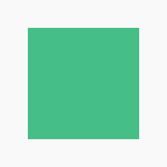
.test{
  width: 100px;
  height: 100px;
  background: #46bd87
}
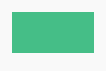
长方形
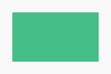
.test{
  width: 160px;
  height: 80px;
  background: #46bd87
}
圆形
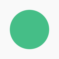
.test{
  width: 80px;
  height: 80px;
  border-radius: 50%;
  background: #46bd87
}
椭圆形
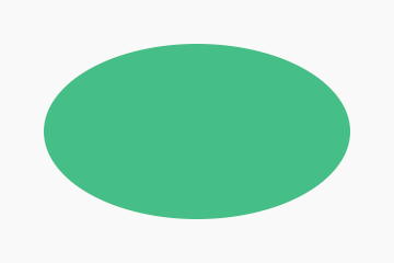
.test{
  width: 160px;
  height: 80px;
  border-radius: 80px/40px;
  background: #46bd87
}
宽度和长度成比例自适应缩放
.test{
  width: 100%;
  padding-bottom: 50%;  /* padding长是宽的一半 */
  background: #46bd87
}
向下三角形(向上、向左、向右同理)
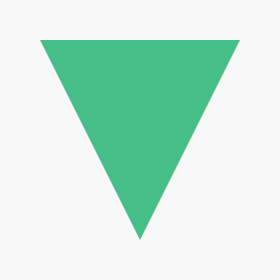
.test{
  width: 0;
  height: 0;
  border-left: 50px solid transparent;
  border-right: 50px solid transparent;
  border-top: 100px solid #46bd87;
}
直角三角形(替它三个方向同理)
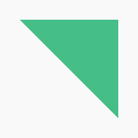
.test{
  width: 0;
  height: 0;
  border-top: 100px solid #46bd87;
  border-left: 100px solid transparent;
}
箭头
.test {
  position: relative;
  width: 0;
  height: 0;
  border-top: 20px solid transparent;
  border-right: 20px solid #46bd87;
  transform: rotate(10deg);
  margin: 20px /* 不重要 */
}
.test:after {
  content: "";
  position: absolute;
  border: 0 solid transparent;
  border-top: 9px solid#46bd87;
  border-radius: 50px 0 0 0;
  top: -32px;
  left: -31px;
  width: 36px;
  height: 36px;
  transform: rotate(45deg);
}
箭头
.test {
  position: relative;
  width: 100px;
  height: 90px;
}
.test:before,
.test:after {
  position: absolute;
  content: "";
  left: 50px;
  top: 0;
  width: 50px;
  height: 80px;
  background: red;
  border-radius: 50px 50px 0 0;
  transform: rotate(-45deg);
  transform-origin: 0 100%;
}
.test:after {
  left: 0;
  transform: rotate(45deg);
  transform-origin: 100% 100%;
}
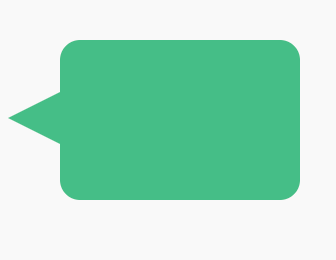
提示框

.test {
  width: 120px;
  height: 80px;
  background: #46bd87;
  position: relative;
  -moz-border-radius:    10px;
  -webkit-border-radius: 10px;
  border-radius:         10px;
}
.test:before {
  content:"";
  position: absolute;
  right: 100%;
  top: 26px;
  width: 0;
  height: 0;
  border-top: 13px solid transparent;
  border-right: 26px solid #46bd87;
  border-bottom: 13px solid transparent;
}
放大镜
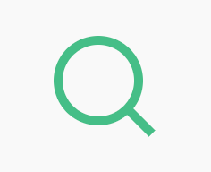
.test {
  display: inline-block;
  width: 0.8em;
  box-sizing: content-box;
  height: 0.8em;
  border: 0.1em solid #46bd87;
  position: relative;
  border-radius: 0.8em;
  font-size: 50px
}
.test:before {
  content: "";
  display: inline-block;
  position: absolute;
  right: -0.25em;
  bottom: -0.1em;
  border-width: 0;
  background: #46bd87;
  width: 0.4em;
  height: 0.1em;
  transform: rotate(45deg);
}
十字架
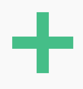
.test {
  background: #46bd87;
  height: 100px;
  position: relative;
  width: 20px;
  margin-left: 30px
}
.test:after {
  background: #46bd87;
  content: "";
  height: 20px;
  left: -40px;
  position: absolute;
  top: 40px;
  width: 100px;
}
小红包免费领
小礼物走一走
部分内容来源于网络,如有侵权,请留言或联系994917123@qq.com;访问量:waiting;访客数:waiting